Code
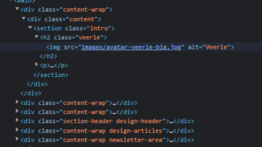
It was interesting lookng at her code and then comparing it to the webpage, her class names are very easy to understand and figure out where it is going to fit in with the page. She uses the same content-wrap class multiple times throughtout the "main" area of her page so that she can easily create a new section.
User Interface - UI
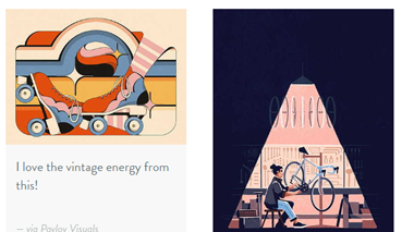
I enjoyed looking and exploring this site due to the color scheme and all the information. At times I do feel like there was a lot to look and it was overwelming in some areas, but not enough to make it unejoyable. This style of work is something I really enjoy looking at and will definitely come back to look at for inspiration
User Experience - UX
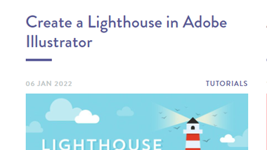
At times when navigating through this website there is a lot going on on some pages. For example on the tutorial page in is filled with links and different cards filling the whole page and it was confusing at points to figure out where to go to get to the next page.
Summary
I would say overall I really enjoyed this website, the colors, style, and information that is provided makes it very interesting. I liked how there is a tutorial section so you can learn more, as well as getting some patterns by subscribing to the news letter.