Code
I noticed that the info sections were using a grid layout for the whole area, then used a flex layout for the information that they wrote. It was interseting how the had the image above the rest of the the rest of the border, but I was not able to figure out how they did that.
User Interface - UI
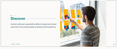
To me the first look at this site was very nice to look at and explore around. It was easy for me to navigate around and the colors were all balanced with none standing out. I felt that each section area with information stood out and made it easy to know where it will lead to with little information so you know what will be page
User Experience - UX
One of the first things I noticed and messed around with on this site was the green block formation that moved around from where your mouse was. This made me more interested right away and led to me to find mor esuch as the hover effects on the section areas and loading screen while switching pages.
Summary
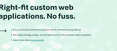
I thought overall this site was a very good looking website as all the colors blended well. I enjoyed when I kept scrolling down on each page something new alway appeared and stayed there rather than just scrolling to it already on there. I feel like you can learn a lot of differnet ideas to design a website after looking over their site.