Assignment 05
- SOURCE - Gayane Gasaparyan
- Where - codepen.io
- When - July 23, 2021
- What - Card magic effect
- Why - It has a interesting loo to it which caught my attention and the effect is
fun and could be used in many ways
How to make this magic card
Step 1 - In this example they use the @property, which allows allows you to rule represents a custom property registration directly and you can use this instead of running JS.
This is created to work on the animation that will make the rgb spinning border. Also, in their example they create two variables in the root to do some math to create their cards width and height, and this is used throughout the code.
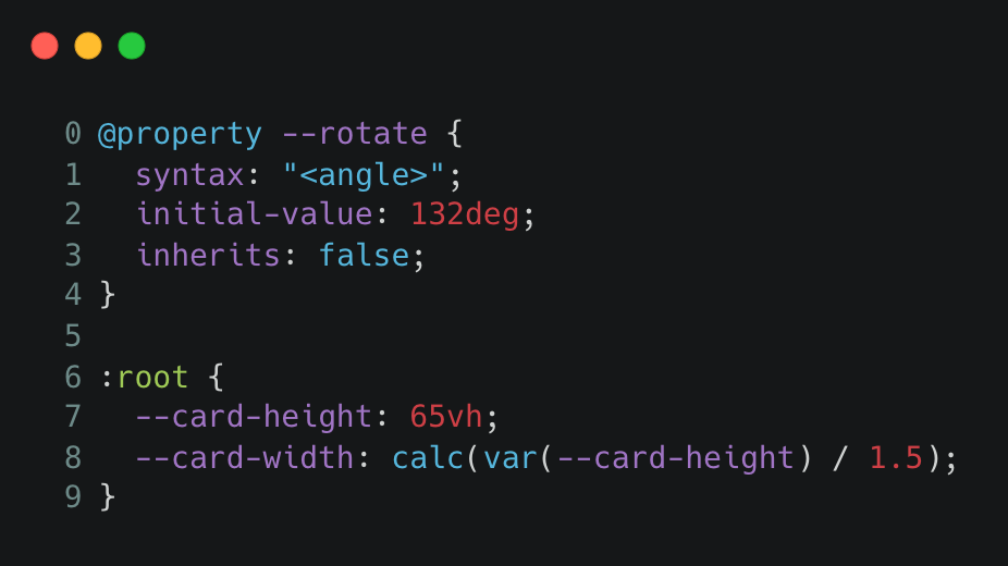
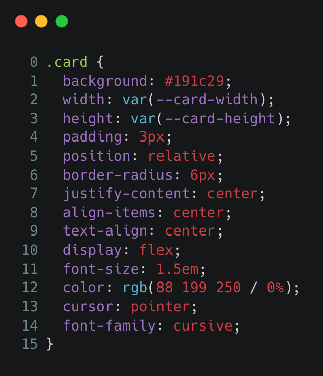
Step 2 - Style your card according to design preference. In their example they use the variables created before to figure the width and height of the card as well as some other methods to ensure everything is centered.
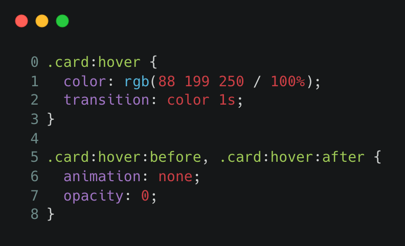
Step 3 - The next by using your card, you create a hover effect on the card so that the animation of the border stops and the words appear onto the card.
Step 4 - In this step this is where spinning border and spinning blur is created. To create the border you can add your create the ::before on your card and style the borders colors and size according to preferences. You then do the same with the rotating blur but by using the :after on the card. To get these to move you add your animation that will be created in the next step.
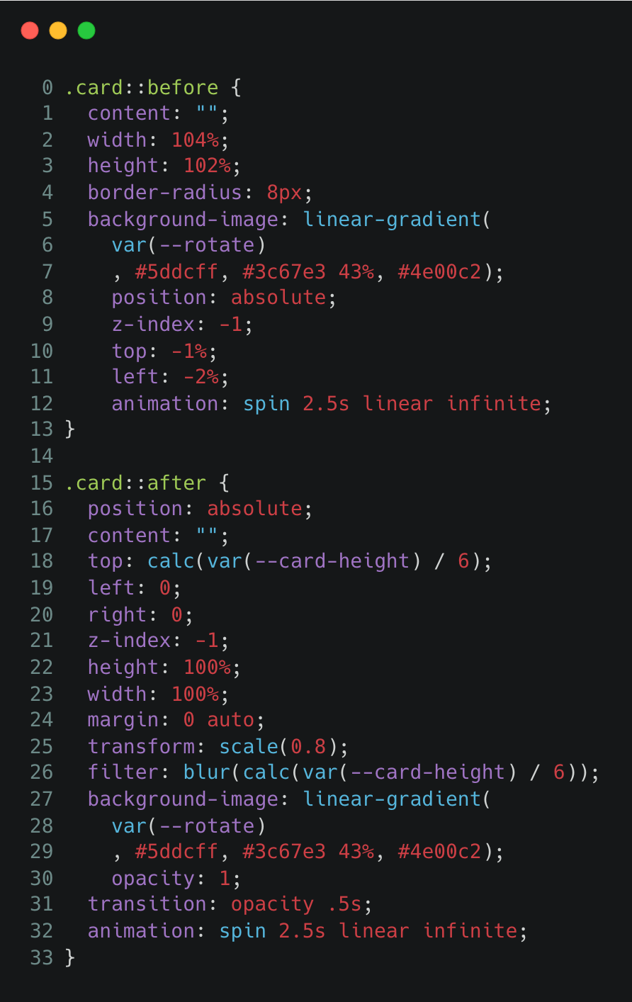
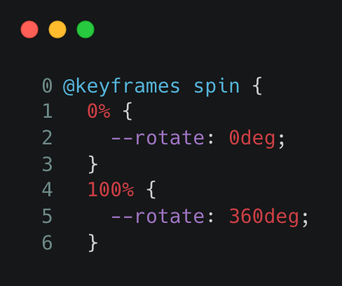
Step 5 - Here is where you create the animation to get the spinning effect on the border and the blur. You use the variable initially created in the first step by using the @property.
Finally, a working example created by me based off of the original code
Hello
- SOURCE - Gayane Gasaparyan
- Where - codepen.io
- When - July 23, 2021
- What - Card magic effect
- Why - It has a interesting loo to it which caught my attention and the effect is fun and could be used in many ways
Step 1 - In this example they use the @property, which allows allows you to rule represents a custom property registration directly and you can use this instead of running JS. This is created to work on the animation that will make the rgb spinning border. Also, in their example they create two variables in the root to do some math to create their cards width and height, and this is used throughout the code.

Step 2 - Style your card according to design preference. In their example they use the variables created before to figure the width and height of the card as well as some other methods to ensure everything is centered.

Step 3 - The next by using your card, you create a hover effect on the card so that the animation of the border stops and the words appear onto the card.

Step 4 - In this step this is where spinning border and spinning blur is created. To create the border you can add your create the ::before on your card and style the borders colors and size according to preferences. You then do the same with the rotating blur but by using the :after on the card. To get these to move you add your animation that will be created in the next step.

Step 5 - Here is where you create the animation to get the spinning effect on the border and the blur. You use the variable initially created in the first step by using the @property.

Finally, a working example created by me based off of the original code